
Wednesday, 24 October 2012
Mark Scheme Targets
As a group we set ourselves a target of getting a level 4's throughout our work. By looking at the below mark scheme lots of work will have to be completed to a level of "excellent". We believe though that if we apply ourselves it is possible to do.


Tuesday, 23 October 2012
Camera
Brief summary on camera techniques - distance

In the image above (http://www.aber.ac.uk/media/Documents/short/gramtv.html) it demonstrates many of the shots used within film.
XLS - Extreme Long Shot
LS - Long Shot
MLS - Medium Long Shot
MS - Medium Shot
MCU - Medium Close Up
CU - Close Up
BCU - Big Close Up
XCU - Extreme Cole Up
All these shots give different aspects to film and are essential in helping the film makers deliver their message.
Long shots, which show all or the majority of the subject are used to often to create establishing shot's. These are where the backgrounds are often shown and sets the location for the rest of the section. Long shots can also be used to to draw attention away from certain characters because they can often fit many into that scene.
One way that medium shots can be used is to display emotion, unlike in a long shot where facial expression isn't really picked up upon you can now see it and the effect it cause, body language might also be something that would be picked up upon.
Close ups show the greatest amount of detail and are used for that purpose. An example of a close up could be shooting someones forehead and showing a bead of sweat dropping down in a tense scene. As this is all that the audience would see, it gives it importance due to it being unmissable.
In conclusion the correct distance of shot is important as it impacts the viewer in different ways. If I look to how it is used in Thriller and in particular se7en (see lower in down the page) they use large amount of close ups. As raised in the analysis it not only gives a sense of ambiguity but it also makes sure that the audience has an understanding of what is happening.
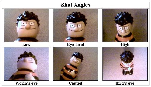
Camera technique - Angle
Like
distance, the angle is an important factor to take into consideration
when creating films and are used to affect the way the audience thinks
when seeing something.
Low Angle - This is where the camera is below the subject resulting in them appearing bigger. This can then help show the subject to have power or dominance.
High Angle - This is where the subject is shot from above and has the opposite effect of a low angle shot. When looking down upon the subject it often makes them appear small and weak.
A mix of both these shots in thrillers would be good as it helps show balance between two people which is something that features quite highly in thrillers.
Eye-level - An eye level shot is quite neutral in terms of giving the subject a sense of power, however it shows the audience what it would be like talking to the subject.
Bird's Eye - Birds eye shots are where the camera is at an angle so high it is looking down on the action. These can give the viewer an alternate view on what is happening on screen
Worm's Eye - In this shot the camera is now almost on the floor looking upwards. Shots like this are good to show people walking or like a low angle shot make the subject look more powerful.
Canted - When a shot is taken at an different angle to normal everything appears different and therefore create a sense of unease.
Point-of-view (POV) - This is where a shot is made is displayed as it would be from the subjects view. This is good as it gives a good sense of what the situation would be like to the audience.
How it's applied in thrillers
Although almost all of the above techniques are used in thriller films some of them are used more than others. One of them that appears frequently throughout are close ups. The best example of this is the opening of Se7en (as seen previously in the blog) This uses only close ups and focuses on small details of objects. Doing this creates an ambiguous tone and the fast paced editing combined with the non diegetic sound creates a tense and scary mood.
High and low angled shots are something which also appear to a lot. These help portray things as either bigger or smaller then they would be seen as a eye level shot. By shooting something from above it's going to make the subject look smaller and less threatening whereas something from a low angle will have the reverse affect.
Camera technique - Angle
Low Angle - This is where the camera is below the subject resulting in them appearing bigger. This can then help show the subject to have power or dominance.
High Angle - This is where the subject is shot from above and has the opposite effect of a low angle shot. When looking down upon the subject it often makes them appear small and weak.
A mix of both these shots in thrillers would be good as it helps show balance between two people which is something that features quite highly in thrillers.
Eye-level - An eye level shot is quite neutral in terms of giving the subject a sense of power, however it shows the audience what it would be like talking to the subject.
Bird's Eye - Birds eye shots are where the camera is at an angle so high it is looking down on the action. These can give the viewer an alternate view on what is happening on screen
Worm's Eye - In this shot the camera is now almost on the floor looking upwards. Shots like this are good to show people walking or like a low angle shot make the subject look more powerful.
Canted - When a shot is taken at an different angle to normal everything appears different and therefore create a sense of unease.
Point-of-view (POV) - This is where a shot is made is displayed as it would be from the subjects view. This is good as it gives a good sense of what the situation would be like to the audience.
How it's applied in thrillers
Although almost all of the above techniques are used in thriller films some of them are used more than others. One of them that appears frequently throughout are close ups. The best example of this is the opening of Se7en (as seen previously in the blog) This uses only close ups and focuses on small details of objects. Doing this creates an ambiguous tone and the fast paced editing combined with the non diegetic sound creates a tense and scary mood.
High and low angled shots are something which also appear to a lot. These help portray things as either bigger or smaller then they would be seen as a eye level shot. By shooting something from above it's going to make the subject look smaller and less threatening whereas something from a low angle will have the reverse affect.
Monday, 22 October 2012
Sound
In todays lesson we revised and learnt some new things on "sound". The first feature we revisited was to combination of diegetic and non-diegetic. We need to now this as almost all media texts contain a combination of the two and is essential when producing our films.
We then looked at something new to us; ambient sound or background noise. Ambient noise comes in two ways either foley or natural. Foley is something which is artificially put in and isn't picked up on screen. The opposite is natural which is where the sound heard is all from the on screen action. The use of both are important with foley sounds being able to enforce something whereas natural shows whats happening.
Other aspects we saw come from voice, the first being dialogue. Dialogue is people talking and helps give a basic narrative to a story. The next type is voice over this is where you can't tell where a voice is coming from but you can hear one over the top of what is on screen.
The final two types of sound we looked at where parallel and contrapuntal. Parallel sound is where the sound fits the action or mood on screen i.e in a horror if there was a killer in a house the music could be tense and and shrill. The opposite of this is contrapuntal where the music does not an example of this could be if in the same situation of a killer in a house some upbeat dance music was playing it wouldn't fit the action and would display a different tone.
Overall what I've learnt is that sound overall does a great deal in order to reflect the moods of film and how its use can change the effect a lot
Thursday, 18 October 2012
Final Survey Evaluation
In total we received over 100 responses on or survey, we were pleased with this as it gave us a much larger audience than our initial pilot surveys. This meant we were given a more accurate picture on the general opinions of the public.

In this question we asked for the age of the participant; either 15-17 or 18+ we received the following results 70% to 30% respectively. This shows that most of the people currently viewing are work at the age of 15-17. This would suggest that making a film with a age certificate of 15 may be more appropriate to the people who had contributed to our survey.
The second question we asked was "Do you prefer films with a 15 or 18 age certificate and why?". Although we had lots of responses the majority verdict did go towards 15's. This ties into the idea of making a film that are already viewing and contributing towards our work.

The nest question we asked was "Do you pay attention to title sequences?". We found this to be important to us to decide wether it should be something that we spend a lot of time on or simply just exert our efforts elsewhere within the project. We scored a 62% rating on people paying attention on the title sequences. This has showed us that it is something that we will have to closely consider as people will be noticing it.


The next question we asked was "What is your favourite sub-genre?". This may come in useful to us when deciding ours to see what is popular, however one thing that may be a concern could be that the most popular genres are heavily saturated and there wouldn't be room for us to put a similar film without copying aspects of other similar. The flip side of this is that we could go into a very open style of sub genre however it may not be as successful or well perceived.
On this question we received the most popular to be "supernatural" with 22% and the lowest being "political" only receiving 5%

The sixth question we asked was "What do you expect to see in an opening of a thriller film?". Some of the responses can be seen in the image above, the results we mainly saw were the stereotypical things you'd expect to see in a thriller. We could use these and stick to some of the conventions of thriller however we wouldn't want to over do it and make it cheesy and cliched.

The next question we asked was "What do you think ruins a thriller film?". Knowing this will help us make sure not too over-do any aspects that would potentially put off viewers. Scoring the highest was "gory scenes" with 26% however this was closely followed by "Homophobic/Racial discrimination" with 25%. By seeing that these two can put people off quite a lot we should remember that when making the film.

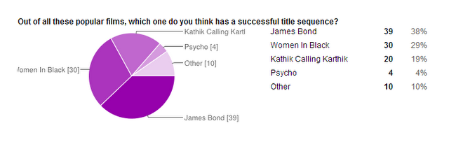
Our eighth question was "Out of all these popular films, which one do you think has a successful title sequence?". By finding this out we can then go on to look at why it worked so well and then influenced by it's success try to make our own that will have a similar effect. Toping the list was James Bond. We didn't find this surprising when we saw our results as we knew how iconic and loved the opening sequences of James Bond films are. Although we do appreciate it James Bond is so iconic and famous anything similar to it would be instantly though of as something from the James Bind series, for this reason it would be unpractical to use it in our title sequence.

To follow on from question eight we asked "Why do you think it is successful?". With the highest score of 47% was music, however as raised in the previous question if people were referring to James Bond it could be because it is iconic and not because it actually had the best effect. However we still understand that music and the other options are all important and not something we should under estimate
In Conclusion I believer my group and I have learnt from this questionnaire and will be a valuable tool to look back upon once we start planning and developing our film.
In this question we asked for the age of the participant; either 15-17 or 18+ we received the following results 70% to 30% respectively. This shows that most of the people currently viewing are work at the age of 15-17. This would suggest that making a film with a age certificate of 15 may be more appropriate to the people who had contributed to our survey.
The second question we asked was "Do you prefer films with a 15 or 18 age certificate and why?". Although we had lots of responses the majority verdict did go towards 15's. This ties into the idea of making a film that are already viewing and contributing towards our work.
The nest question we asked was "Do you pay attention to title sequences?". We found this to be important to us to decide wether it should be something that we spend a lot of time on or simply just exert our efforts elsewhere within the project. We scored a 62% rating on people paying attention on the title sequences. This has showed us that it is something that we will have to closely consider as people will be noticing it.
Following that we asked "Do you prefer title sequences to be fast or slow?". We received a 57% response saying fast, this would imply that making a fast sequence would be more popular however a possible alternative would be to try and work out why slower title sequences aren't so successful and try to amend this.
The next question we asked was "What is your favourite sub-genre?". This may come in useful to us when deciding ours to see what is popular, however one thing that may be a concern could be that the most popular genres are heavily saturated and there wouldn't be room for us to put a similar film without copying aspects of other similar. The flip side of this is that we could go into a very open style of sub genre however it may not be as successful or well perceived.
On this question we received the most popular to be "supernatural" with 22% and the lowest being "political" only receiving 5%
The sixth question we asked was "What do you expect to see in an opening of a thriller film?". Some of the responses can be seen in the image above, the results we mainly saw were the stereotypical things you'd expect to see in a thriller. We could use these and stick to some of the conventions of thriller however we wouldn't want to over do it and make it cheesy and cliched.
The next question we asked was "What do you think ruins a thriller film?". Knowing this will help us make sure not too over-do any aspects that would potentially put off viewers. Scoring the highest was "gory scenes" with 26% however this was closely followed by "Homophobic/Racial discrimination" with 25%. By seeing that these two can put people off quite a lot we should remember that when making the film.
Our eighth question was "Out of all these popular films, which one do you think has a successful title sequence?". By finding this out we can then go on to look at why it worked so well and then influenced by it's success try to make our own that will have a similar effect. Toping the list was James Bond. We didn't find this surprising when we saw our results as we knew how iconic and loved the opening sequences of James Bond films are. Although we do appreciate it James Bond is so iconic and famous anything similar to it would be instantly though of as something from the James Bind series, for this reason it would be unpractical to use it in our title sequence.
To follow on from question eight we asked "Why do you think it is successful?". With the highest score of 47% was music, however as raised in the previous question if people were referring to James Bond it could be because it is iconic and not because it actually had the best effect. However we still understand that music and the other options are all important and not something we should under estimate
In Conclusion I believer my group and I have learnt from this questionnaire and will be a valuable tool to look back upon once we start planning and developing our film.
Wednesday, 17 October 2012
Se7en Opening Analysis
|
Film Title: Se7en
Director: Kyle
Cooper
|
||
|
|
Technique
|
Effect
(Analysis)
|
|
Camera – distance, angle,
movement…
|
|
|
|
Editing – speed, style…
|
|
|
|
Sound – effects, musical
score…
|
|
|
|
Mise-en-scene – props,
costume, setting, lighting, colour…
|
|
|
|
Titles – font, colour,
placement, over black / over clip…
|
|
|
Pilot Survey
Before Producing our final survey (see further down the page) we deicded to create a pilot survey to assess the best way on sending the questions out and also what we wanted to find out.

By asking how old poeple are we can see what the most common age is of people viewing our work, this can come in handy when it comes to producing our work and what ge certificate we select.
Asking what certificate people prefer is also important to give us a general opinion for when we decide on what are can be, however the previous question does have to be taken into consideration as if everyone was under 18 but they prefered 18 films it wouldn't be appropriate.
As we will be making an opening sequence it is quite important we understand what people enjoy. For this reason we ask do they like fast or slow openings. Although this is a start we could develop it in are final one by asking why they like it.
 The final question, we asked what people generally expected to see in a thriller film.
Most of the answers varied which did not help us as each of the audience liked different things. On our next survey, we should keep the answer limited so that they have a choice of what they expect to see to make it less varied, helping us get the best results.
In conclusion this pilot has helped show us how we can develop are questions in order to find out the information we want.

By asking how old poeple are we can see what the most common age is of people viewing our work, this can come in handy when it comes to producing our work and what ge certificate we select.
Asking what certificate people prefer is also important to give us a general opinion for when we decide on what are can be, however the previous question does have to be taken into consideration as if everyone was under 18 but they prefered 18 films it wouldn't be appropriate.
As we will be making an opening sequence it is quite important we understand what people enjoy. For this reason we ask do they like fast or slow openings. Although this is a start we could develop it in are final one by asking why they like it.
 The final question, we asked what people generally expected to see in a thriller film.
 Most of the answers varied which did not help us as each of the audience liked different things. On our next survey, we should keep the answer limited so that they have a choice of what they expect to see to make it less varied, helping us get the best results.
In conclusion this pilot has helped show us how we can develop are questions in order to find out the information we want.
Jess' Analysis of "Frozen"
I have decided to analyse a completely different type of thriller. I am going to analyse a film called frozen which is an American film. The film is about three skiers stranded on a chairlift and forced to make life-or-death choices that prove more perilous than staying put and freezing to death. I am hoping to find out if the opening of Frozen is anything like the Bollywood thriller I analysed. I will have to look out for the same things such as: how the music and sound sets a tone in the opening, how the camera and editing present characters and how the camera uses shots to establish the location and characters body language, how the mise-en-scene creates a type of atmosphere within the opening and if the title sequence has any relevance or creates suspense.
Frozen is a 2010 American thriller and horror film written and directed by Adam Green and starring Kevin Zegers, Shawn Ashmore, and introducing Emma Bell.
Music/soundFirstly, the sound in the title sequence sets a very sinister tone in the movie as you hear a large sound of lighting and thunder which is scary for the audience. The scene opens up with only diagetic sound. The diagetic sound is of the equipment rustling and creaking. This creates a very ominous tone as it sounds scary and mysterious as the audience does not know what is going to happen. After this, the non diagetic sound comes in, the sound is very upbeat and fast which create a very positive tone in this scene which is very different to the diagetic sound which was heard before. All of this happens very fast (in the first minute) - This is significant because it is exciting for the audience as the scene and tone has changed numerous times which is very thrilling. The diagetic sound in the background helps make the scene look and feel more realistic as you can hear people talking and people skiing. This helps make the location and story line more believable for the audience.
Camera/editing
The film opens up with various close ups of the electronic ski equipment being moved. This reinforces the ominous tone as the close ups of the metal rustling make it look like something will break or something bad will happen. The camera then switches to a long shot of the mountains to establish the location they are in. This helps the audience see and view where they are and what the atmosphere is like.The director did this because the audience could get a more advanced insight of the scenery. The camera then focuses on people on the ski lifts. This already tells the audience that the ski lift in the movie plays a big part because of the amount of shots the director has used of it. The camera then switches to a mid shot of the three protagonists. The director cleverly uses close ups of them all, one by one to show their importance in the film. The camera shoots each character at eye level and over the shoulder to show the audience that they are all equal and as important as each other.
Mise-en-scene
The lighting is very dark when the film opens up. This is because the director wants to achieve a sinister tone and atmosphere in the start of the film. However, the next shot juxtaposes as he lighting is very natural, not too bright but not too dark as it is in the middle of the day. The lighting is also helping making the scenery look realistic because it is very natural. The clothing on the characters is mostly the same, large jackets, trousers and snow boots. This is what the audience would expect them to be wearing as the film is based on a ski resort. All the ski equipment such as the ski lift, cafes etc helped make the shots look authentic and realistic. It also gives the audience a more advanced insight on what it looks like when you go skiing.
Title sequence
The title sequence is very simple in Frozen. It has some interesting parts such as when it says which company made the film it has vibrant colors such as a bright blue. However, it then goes straight into telling us the main cast members. It has a black background with white writing. Even though these two colors contrast, neither of the colors are vibrant which kind of makes the movie come across depressing. The font is in serif which makes the title sequence look very elegant, sophisticated and professional.
What I've Learnt
Reading this analysis, one of the features that stands out to me is how the filmakers set pace. The name "Frozen" makes you think about having to escape the cold for your life in the context which is what the filmakers enforce by the use of non-diegetic sounds. By using a quick beat song it gives pace and helps set up the resulting story
Jess' Analysis of "Gupt"
I have decided to firstly analyse a Bollywood thriller. I chose this because it will be very different to a stereotypical Hollywood thriller film. Before I start my analysis I will need to think about what I should be looking out for. First of all, I will need to think about the music and sound and how it is used to create a tone in the opening sequence. I will then go onto camera and editing to see how the camera creates and establishes the location, setting and how the camera presents the different characters. I will then look at the mise-en-scene and see how the costumes, lighting etc are used to create a theme of thriller in the movie. Lastly, I will look at the title sequence and see if it creates and achieves suspense and also see if it creates a certain type of atmosphere before the movie has begun.
Gupt: The Hidden Truth. The film is a 1997 Bollywood mystery suspense thriller film, directed by Rajjv Rai. The film starred Bobby Deol, Manisha Koirala, Kajol, Peresh Rawal, Om Puri and Raj Babbar. It was one of the biggest successes of 1997.
Music/sound
The opening sequence begins with diegetic music. Firstly, it is very calm playing sound which is very traditional Indian music which comes across very formal and professional. However, it then makes a sudden contrast and you hear a scream which grabs the audiences attention straight away. It then plays sound which is upbeat but the sounds are very mysterious which results in creating a large suspense in the opening of the film. The director purposely did this to engage the audiences concentration as he has quickly made a fast and sudden change which establish the audiences attention. When the film starts, you hear a large amount of people protesting and shouting, you can also hear police cars. This already sets an ambiguous tone as the audience doesn't know what is going on. The sounds of the police cars are significant because it already denotes there is danger in the film.
Camera/editing
When the film begins there is over one hundred people protesting. The camera is shot a low angle to show they are dominant in the scene as there is so many of them. The camera is also is shot at an extreme long shot so the audience could see the amount of people that are protesting. The camera also continuously pans from left to right to also establish the location they are in and to also help the audience gain a more advanced insight on the amount of people who are there, protesting. This already creates suspense in the movie as the audience will start to ask themselves questions such as: why are they protesting? etc. The camera then tilts down to a close up of the police cars. This shows the audience a clear view that the police have arrived in the scene. However, because the police cars were parked underneath where the people protesting were standing, it makes the police seem less dominant as they were positioned below the people. Although, this could just be because there is a small amount of police compared to the people. The camera uses a lot of mid shots of the police to display their body gestures and language. It also shows their facial expression without getting uncomfortably close to them.
Mise-en-scene
The film opens up with natural sunlight, which helps display a realistic shot. The props such as the costume on the police officers is significant because it all looks very real which helps the film look and feel realistic to the audience which helps the plot and story line come across more believable. The setting is is quite restricted at first as the people are positioned outside a large building, but because there is so many people it is hard to see what the building looks like. The framing is very loose as the characters in film have the ability to move around protest. From what I could see, the building was very large and looked very heavily decorated with shapes in the walls and flowers. This juxtaposes with the characters and police cars as the building looked very feminine and pretty. Whereas, the police cars set an ominous tone within the scene, along with the police and the people protesting which creates a lot of negative signs. The director could have done this to try and show the audience that not everything in the scene and film are negative, to show the audience signs of hope.
Title sequence
The film opens up with the colors blue and gold. The colors create different signs such as stars. The blue is very significant because the film is a Indian-Hindu movie. The blue is representing a certain god called Krishna. This helps the audience gain a slightly better understanding on some aspects of the Hindu religion. The gold in the title sequence represents the wealth and extravagance of the Indian tradition and Hindu religion. After this, the picture then fades to black and then goes on to showing a picture of two Hindu gods which are called Brahma and Vishnu. Using these two gods in the title sequence is important because they are both very well known gods within the religion and they also share a special relationship which then results in appealing to the audience as they are more likely to be interested. The title then goes on to present their title, key production and cast members. There is a shadow of a lady dancing continuously whilst the cast members names show up. The dancing shadow lady is significant because you cannot view or see what she looks like which creates suspense and mystery. Also, her body is very thin and how a stereotypical “sexy” women would look like. This is important because they have used this lady to engage the audience as her shadow looks very inviting. The cast members name come up in sans serif in an orange text color. The orange is very bright which is noticeable for the audience. The color of the font contrasts with the deep blue background which helps the cast members name stand out more. The sans serif font the text is in also helps the audience notice and acknowledge the names that are shown. Also, a gold coin is shown throughout the title sequence, it is moves across the screen, from left to right and up and down. The gold coin is important because it is in an old historic Hindu story. Including the gold coin helps the reader engage into the title sequence. The title sequence achieves a mysterious tone and atmosphere because of the colors and shapes they have used throughout it.
Overall, I feel as if I have completed this task well. I had to carefully look into what tone the music creates, what the camera is establishing, what the mise-en-scene means in the film and how the title sequence creates suspense. However, I do not know much about the Hindu religion which is why I struggled slightly as I did not understand some of the signs and words which were said in the film. I tried to look up what they meant, such as the gods etc which did help me gain a better understanding and knowledge of the film and religion but did not help me enough as I feel as if my analysis of the film could be better. Although, I have learnt a lot about how Bollywood thrillers create suspense. The music plays a big part in the opening of this thriller as when I heard a scream it engaged me into the film. Also, when the sound was playing it sounded very mysterious which built up to a mysterious and ambiguous tone being created. I now know that when I come to making my opening sequence I will have to think about the music I am putting into my film as I want it to create the same effect and engage the audience. In addition to this, I learnt how the camera uses long shots and pans across from left to right to establish the location and setting. When it comes to making my movie I want to practice doing this so I can establish the location where I am setting my film.
What I've Learnt
By reading Jess' analysis of "Gupt" one of the key aspects I have learnt is how a culutural understanding is key when analysing media texts.
As Jess states "I do not know much about the Hindu religion which is why I struggled slightly..." this shows us that then when we make our film we must fully understand the culutral and social backgrounds to make it authentic as possible, because if we were to create a "bolloywood" or other style unifamilar to us we could make many mistakes that could possibly be even offensive to some people.
Tuesday, 16 October 2012
Jess' Analysis of "Karthik Calling Karthik"
Karthik Calling Karthik is a 2010 Indian psychological thriller film, written and directed by Vijay Lalwani and produced by Farhan Akhtar and Ritesh Sidwani under the banner of Excel Entertainment and Reliance Big Pictures.The film starsFarhan Akhtar and Deepika Padukone in lead roles Ram Kapoor and Shefali Shah play supporting roles in the film. The film's music was composed by the trio of Shankar-Ehsaan-Loy, while the background score was composed byMIDlval Punditz and Karsh Kale.
Music/sound
The film opens up with noises of buttons on a phone being pressed. Then, a very upbeat sound comes in, with the noises of the button still happening and going off. This already creates suspense in the title sequence as the tone is thrilling. However, a calming voice then comes in with the music and sound which contrasts with what the audience have just heard. Hearing the voice sing very calmly changes the tone and makes it very soothing and light hearted. Making this sudden change engages the audience into the film as there is slight confusion because of the sudden changes of the sound. Although, you then start to hear whispers and someone saying in a very creepy voice "pick up the phone". This is significant because it again, changes the tone and atmosphere and makes it very dark and sinister. Also, by saying "pick up the phone" in a scary frightening voice it makes the audience think that something bad is going to happen and also gives the audience a more advanced insight of what the film may be about which in this case, would be something to do with a phone. In addition to this, when the film starts you hear noises of the protagonists nightmare. The noises are very dark and sinister as you can slightly hear a child crying out for help. The non diagetic sound that is played on top of this helps make the scene look very scary as the sound is very slow and creepy. When the protagonists wakes up from his nightmare, sad music is played to create a melochloy tone in the scene which makes the audience feel sympathy for him. It then shows him talking on the phone to someone, however, he speaks very quiet and shy which shows he is depressed or upset.
Camera/editing
The camera plays a big part in the opening the film and the editing too. When the film begins, you see into the main protagonists nightmare. The nightmare is of two children, one of which is trying to hurt the other. The camera uses a lot of different types of shots to achieve different things. Firstly, there is a close up of a little boys hand, touching the grass. This conveys innocence as you can tell the little boy is experiencing things for the first time as he is interested in something so simple as long grass. It then goes straight into a long shot of the location, which looks like a very poor location and setting as the buildings are all broken and the grass hasn't been cut. However, the long shot helps show the audience what the location is like. The camera then goes onto a low angle shot of the older sibling, trying to be horrible to the younger sibling. By using a low angle shot it helps the older sibling look more dominant in the scene and displays that the younger sibling is helpless as the camera is looking down on him. The editing also helps make the scene look scary as it cuts back and forth of the older sibling trying to be horrible to the younger sibling and then of the younger sibling trying to run away. This is important because as it cuts so quickly the audience don't know whether the sibling will escape or not. When the film properly begins, the camera is shot at a close up of the man when he wakes up. It then zooms out on him to show his facial expression without being uncomfortably close. You can tell he looks very distressed in this scene by the way he is looking down. The camera then goes on to various long shots, mid shots and close ups of him doing normal, day to day things such as getting dressed, washing his face etc. However, it then goes onto a slightly high angle shot of the camera looking down on him whilst he sits on the bed. The shot also shows his room which makes him come across very lonely and isolated as he is being shot in a big area and he is all alone. It then goes onto a bird eye view of him walking down these very large stairs which also reinforce his loneliness as the stairs look so big compared to him.
Mise-en-scene
When the film opens up, the lighting is very dark and shows a lot of shadows behind the main protagonist. This makes the atmosphere in the scene come across very dark and sinister which results an ominous tone as the audience doesn't know what will happen. The next shot then contrasts with the previous shot as the lighting is very natural and even though because of the camera the protagonist looks very isolated, the lighting creates a sense of hope as it is bright and creates a positive atmosphere in the scene. The props when the scene opens up are important as they help make the film look realistic. The props such as; socks, bed, chairs, table make the room look genuine and real. The costume the character is wearing is a business suit which shows the audience, even though he does not have a 'fancy' flat, he has a good enough job to have to wear a suit which conveys his intelligence.
Title sequence
I think the title sequence is the most important thing about the opening of this thriller. It plays a very big part on creating a tone and atmosphere. The first thing you see is a a phone inside a phone box, with a dark black background, already creating a gloomy atmosphere. Throughout the title sequence the names of the cast members show up in white sans serif writing. The reason why they are in white is because the images that appear in the title sequence are very dark which is why the writing contrasts with them, helping the names to stand out and be more noticeable. The images that come up in the title sequence stay on the screen for about 2 seconds. This gives the audience time to look at the cast members name that has appeared on the screen and to look and view the image. Each of the images are significant because a lot of them introduce characters. However, the characters face is never shown properly to create suspense as it is more of a mystery for the audience to work out if they are good or bad. There are several images of phones in the title sequence, this already indicates to the audience that the film has something to do with phones or calling someone. The director has purposely done this to imply, but not to tell the audience a few important key aspects in the film. Each of the images that are shown are never positive or happy. A lot of the images show characters, alone looking very isolated or if they are with someone, one of them is usually looking very angry or sad which creates quite a melonchloy atmosphere in the beginning of the film. The colors in the title sequence are normally blacks, whites, greys and light blues. The white, grey and black are very professional colors which make the title sequence quite professional. However, the blue helps make the title sequence a bit more vibrant as the other colors that are used are quite dull.
Overall, I have learnt a lot about Bollywood thrillers and how the opening sequences create suspense. I found out that by implying and hinting in the title sequence of what the film may be about it creates a sense of mystery which engages the audience into the film more. I feel the title sequence is extremely successful in making the film look mysterious and ambiguous. The sound, lighting and digital images all help out too. I have found out that by using dark lighting, creating shadows make scenes look very sinister and dark. I feel as if I have done this task good. However, I feel as if I could of analysed the title sequence more but I did find out enough information from it as I have learnt a lot about how the title sequence creates mystery in the beginning of the film.
What I've Learnt
By reading Jess's analysis of "Karthik Calling Karthik" she demonstrates the importance of the use of title sequences, Jess also brings up the emotion and thoughts provoked by the colours used, also the use of images and not continuos filmand how they can impact it.
Monday, 15 October 2012
Rachel's Analysis of "Salt'
SALT: Action Thriller
Directer: Phillip Noyce
Directer: Phillip Noyce
Camera/editing
The clip starts with a zoom out of the ‘Columbia’ logo, then cuts straight to a black backdrop, and bold, capital, white writing appears and disappears. Followed by the words ‘NORTH KOREA/ TWO YEARS AGO’ which lets the audience know the film is going into the past. Noyce uses a P.O.V. (point of view) shot of Evelyn to bring us straight into the diegesis and see to men open a door. The audience then sees a close up of Evelyn’s face which shows lots of blood and bruising. Noyce uses a shot along the floor to show her being dragged out of a small, enclosed room. We see she is covered in blood and wearing only grey, lace underwear. This connotes femininity and weakness. A medium shot is used to show her being dragged and dropped onto the floor, then a P.O.V. of Evelyn to show 3 men crowded round her head. We then see a close up of her face, feet, and finally her hands, each tied together with ropes. We see a long shot of her stretched out on the floor, tied up with rope which connotes restriction. We hear dialog of her pleading to go home which connotes weakness, then we see a P.O.V. of Evelyn to show a close up of one of the soldiers facial expression of anger and frustration. Noyce then uses a close up of a hand grabbing Evelyn’s face, and attempting to place a plastic pipe into her mouth. He uses another P.O.V. of Evelyn, then a medium shot of a man pouring water into a bucket which plunges down the tube into her mouth. A man kicks her face, and then a long shot is used to show her rolling around on the floor in pain with the three men still surrounding her head. The first scene fades into a black backdrop and then slowly fades back into the second scene. The second scene starts with a P.O.V of Evelyn to show two soldiers, followed by a metal gate, with her colleague stood on the other side. We see a close up shot of her face to highlight her facial expression which shows a swollen, black eye, and a cut lip representing her on going torture. Noyce uses another P.O.V. of Evelyn to show a long drive and people in the distance. A medium shot is used of the man opening the barrier which connotes her freedom. We then see a medium shot of the back of her and her colleague heads which may connote how she’s turning her back on the past. We are shown another close up of her face showing us her black eye, and cuts, highlighting the damage caused from this imprisonment. We see an E.L.S (extreme long shot) and deep space is used whereby the barrier is close to the camera and she is in the distance, representing the long process of her release. There is then a succession of long shots and close ups of Evelyn and her husband as she is walking to him. We see an S.R.S (shot, reverse, shot) of when her husband sees her. He shows no reaction which means he may be hiding the pain he feels and acting strong for her. The scene then fades into the title.
Sound/music
Quiet, tense music plays at the start of the clip, and we hear a Korean man speaking whilst the screen is still black. Through this scene we hear a number of diegetic sounds such as, keys, Evelyn being dragged and falling on the floor, ropes being tightened, footsteps, and the water flowing down the tube into her mouth. As the scene fades you hear her saying ‘I’m not a spy, I am not a spy’ making the audience sympathise for her. All this diegetic sound creates a sense of reality bringing the audience into the diegesis. In the second scene we hear the gate and the barrier opening, each presenting her freedom. When Evelyn is released a man clearly says ‘exchange’ ensuring the audience understands why she has been released. The non-diegetic music builds up as she walks towards her husband, then fades as the title appears.
Mise-en-scene
Setting/lighting:
At the beginning of the clip we see a dark room, and soldiers all in identical, dark green uniforms. We see rope ties which may connote a form of slavery and barred doors which denote imprisonment. There are dark brick walls, and a small amount of light shining through a small window. This may represent a small amount of hope of her being released. The darkness of the room connotes danger. In the second scene, there’s natural light as she walks out, concrete buildings and army trucks, this connotes the power the Koreans hold. We see a black and yellow barrier which connotes danger, as well as fences either side of her highlighting the security of the place she has been kept in. There’s a second barrier near to the cars she will escape in, this is coloured red and white. Red and white may connote a hospital and therefore help.
Costume:
We see that Evelyn has blonde hair which may connote a lack of intelligence leading to how she got arrested in the first place. Furthermore she is wearing only grey, laced underwear highlighting her femininity and vulnerability. In the second scene Evelyn is wearing a white top, the colour white connotes innocence and purity, making it seem as though she is not guilty. The cars are also coloured white, this connotes purity and reinforces the idea that she in innocent.
Titles:
The clip starts with a black backdrop, words appear in bold, white, capital letters which contrast with the background. The words fade in quickly, appear for 3 seconds, then disappear quickly increasing pace and making the opening tense. Words such as ‘presents’ are smaller compared to big company names which stand out due to their larger size. Three minutes 37 seconds into the film shapes appear from the edges of the scene into the middle to create the word ‘salt’. The font is very angular, bold and masculine compared to the vulnerability we’ve seen so far of Evelyn. We can still see the scene through the letters until it fades into a bold, bright red colour. Red connotes danger and the word ‘salt’ appears again over the top of the other, this time in white. White connotes innocence, therefore the red and white together may connote an innocent person in danger. In addition the fact that the word salt appears twice may be because Evelyn is a spy and therefore has more than one identity. Furthermore, no names of actors, directors, or produces are shown in the opening which relates to the theme of the film being about not knowing anyone’s true identity.
What I've Learnt
One of the things that I learnt is that who colour in the title sequence can connote emotions. The use of font can also impact this. The use of POV shots also appear to come up a lot in this extract, and it can be seen that the use of them are a good way to input what it would be like for that character in the select situation.
Subscribe to:
Posts (Atom)