Sunday, 14 April 2013
Wednesday, 3 April 2013
Target Audience Survey
To find out what people think about our film we create a survey to gather information and opinions from members of the public. Please feel free to fill it in by clicking the link below.
https://docs.google.com/forms/d/172x-t1evDRJI5zE2iLT-YJYyVo79CdZEQSOBqebLp-c/viewform
https://docs.google.com/forms/d/172x-t1evDRJI5zE2iLT-YJYyVo79CdZEQSOBqebLp-c/viewform
Friday, 29 March 2013
Sunday, 24 March 2013
Finished Titles
With the task of creating a title sequence producing the psychical titles was something my group and I took a long time to think about and debate.
The opening of our sequence starts with the image (as seen below) when conducting our research many of the real media products that we reviewed often showed the production company with their logo which is why we decided to start ours in that manner. Also looking at real media products taught us that black and white are common colours to be used as well as the length being between 3-5 seconds.

The second title we used was more simple than the prior and showed the name of the film company. Trying to produce a professional looking project we wanted to base lots of decisions on how professional set ups to do so, this is why we started with the opening two titles.

The final title I created we approached in a different way. We used Adobe After Effects to produce an animatic title that fitted into the theme of our production. Although this was much more challenging as a group we believe it helps add to the quality of the overall production.
Some of the common themes throughout all these titles using a white font with a black background I believe this helps add continuity to sequence with all the title matching appropriately.
The titles for the "cast and crew" we put over the top of the film as we found it to be the most efficient way of putting the shots we wanted in as well as liking the effect it produced.
Monday, 18 March 2013
Creating Titles

One of the tasks that was still outstanding within my groups product was that of the opening titles. When watching some current media texts the vast majority if not all start with the name of the production company. We selected a lightning bolt to be the figure head of the company as like the smoke with the previous title can be used to represent some conventions within thrillers and our product. With lightning coming in storms the well known saying 'the calm before the storm' is something I believe we showed within our sequence with a slow build up as found frequently throughout the thriller genre into a more climatic end. The black background on white text is again something found regularly on titles however some more modern companies have started to animate their images and introduce colour for these opening titles.
I created the image itself using another Adobe product (Photoshop CS6) where the 'difference cloud' effect combined with some layer masking and colour alteration gave the above effect. The text itself is also something I thought about. With the lightning being a sharp electric look I wanted to use a similar effect through the text so that is why I selected a modern looking text. The image above also shows a rule of thirds grid which I left on. I used it to try and get the composition correct with the main subject being that of the lightning in the central third and the text being of lower importance put into the first and third sector
To advance on this I could see if I could add some motion perhaps using After Effects or a similar piece of software however my group and I will first have to view the still image with transitional effects before making a decision.

Tuesday, 12 March 2013
Analysis Of Current Version
With the help of our teachers, me and my group sat down to review our current progress.
Positives
Some of the positives we agreed on include the mood and tone set by the mise-en-scene and sound. We deliberately used a melancholy non-diegetic score as the narrative follows that path. The shots of the protagonist looking out of the window also suggests a reminiscent mood which leads nicely into the flashback sequence.
We also agreed that the flashback sequence achieved what we aimed for it to do so. With the transition effect of white fades making it noticeably a flashback. The innocence of the younger version of the protagonist is also something we though was successful and is something we can work on in the future versions.
Having a good group dynamic has also helped get us the stage we are at now with each member understanding their roles and responsibilities
Negatives
Some of the things we are not quite sure about include the later stages of the sequence feeling quite repetitive and boring. This is probably because although their is fair amount of shots used they often come at the same angle or the framing is similar. To improve this one of our options is to intercut some new footage we will have to film including the younger version of our protagonist.
What Next
In order to continue work efficiently and professionally to match our deadline me and my group still have to produce some introductory titles along with some minor editing involving the sound levels. One thing we still have to discuss is wether or not to do some further shooting and choose the option of intercutting some more footage.
Friday, 8 March 2013
Re-shoot of Flashback Scene Evaluation
One of the main criticism from our main cut was how the "flashback" sequence was slightly confusing and reduced the continuity of the overall piece. To combat this as a group we decided reshooting the whole sequence would be the best option as there where many things in hindsight we could of done better.

Mise-en-scene
The most noticeable difference between this version and the last is the incorporation of a second actress. Not having a reaction from our protagonist was one of the flaws in the last cut as it lead on to her reaction seeming unjustified. With the inclusion of her know we believe it flows much better. The actress we used was also something we had to carefully think about. We wanted to use a much younger actress for this sequence compared to that of which we used for all the other clips. Due to the fact we wanted to ensure this was a "flashback" to the audience we took a deliberate step of selecting a much younger actress. Some of the things we had to think about when doing this was when selecting potential actresses making sure they looked similar to our other actress to create authenticity and sense of realism. Further ways to ensure authenticity was having the actresses dressed in appropriate clothing that being a school uniform for the protagonist and smart/casual teaching dress for our teacher.
The backdrop for this scene we tried to keep as neutral as possible directing all of the focus to the two character. Unfortunately we could't do it for all of the room but gave it our best efforts.
Decisions like this in the mise-en-scnene I believe help add to a sequence with much better continuity thats keeps the audience interested.
Camera
To try and establish for the audience what is happening we opened using a long shot showing both characters looking concerned. We then went to a close up of the girl to try and show the true emotion which was the purpose of the sequence and is best showed through the actresses facial expression. Following this we cut to a close up of the teacher telling her the tragic new of her brother going missing again using the close up to show emotion to the audience. The final shot then cuts back to the girl to show her reaction. Although very simplistic we believe in these shot we display everything we intended.
Sound
The most important aspect regarding sound in this section was the diegetic sound of the two people communicating. The soft spoken voice combined with the close up showing emotion we believe displays a sad and sombre tone which we wished to do.
The next stage it to edit this into the main sequence and possibley add some post production fx like we did in the first cut making it monochrome as that was one of the things that was commonly seen when researching flashbacks
Creating titles and Editing Second Cut
In a attempt to add some professionalism to my groups overall product I tried to create some animatic title using Adobe After Effects.
Looking back upon the early research my group and I did the majority of thriller titles used the colour scheme of black and white. I continued to do that with the ones seen above as the neutral background of black helps the effect stand out as well as being one of the conventions of "thriller". The smoke effect was also something purposely used with our narrative being about siblings losing contact with each other the smoke in some part was a metaphor of this as smoke is something that is lost and you can't recapture. The duration of the clip was also something based upon the early research we undertook giving the viewer enough time to read and absorb the information and aesthetics but not bore them.
As this title is still a "first draft" some aspects I might change includes that of the font and also neatening the transition. Although the font is clear and easy to read I think it is a bit bland and boring and a more interesting font may suit the overall production better.
With regards to editing our second cut this has largely gone succsesful due to the experiences of previous tasks boosting our effeciency, time management and editorial skills. Having now shot all the shots we planed for our next task is to as a group sit back and make a decision if further reshoots are required to develop on the current cut.
Wednesday, 6 March 2013
First Cut and What Next?
After analysing are first cut with the help of our teachers we have decided to re shoot the large majority of are initial cut. The most fundamental issue that came from out first sequence was the mise-en-scene in the final climatic sequence at came clear that to some viewers it may appear quite random and they could question why things are there. To improve this what we could do is use more fewer props that have a clearer and more relevant meaning to are narrative. Another big problem is regarding sound. The diegetic sound came out really nice in my opinion however the non-diegetic score is something we are still looking for at this current time my group and I haven't been able to do find a viable source that would fit into our sequence. We also had some issues with the camera work on the first tilt we used its a bit wobbly and this is the same on one of our pans. Although these shots help express the idea we want to get across the poor execution makes it look unprofessional. To counteract these we are simply going to have to take more time when re-shooting next time. In terms of editing this is where we believe we have done best. My group and I believe we have created a smooth running sequence that has a good sense of continuity. The only issues that we can really think of is about the transition between looking out the window to showing the lead characters eyes and then cutting back after the flashback sequence which some people saw as a bit confusing.
The final few changes that we are going to make is making our actress look more "drunk" after drinking a bottle of whiskey it looks a bit unrealistic having our character stroll around as if nothing has happened. On the whole we are quite pleased with the way the first cut has come out however there are small changes that in the long run will help produce a far more professional result.
Tuesday, 26 February 2013
Filming: Shoot 2
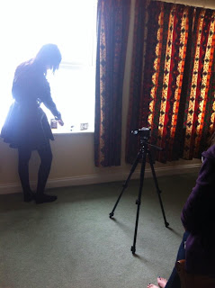
For our second attempt at filming our previous experience had helped. By having two previous experiences in filming it made for are most efficient shoot yet. Areas I believe that I have improved the most in include setting up a shot or "framing" with the camera also as a group setting up the mise-en-scene has improved from our first draft to portray a more accurate representation of the emotion we wanted to show
 The acting was pretty much the same time from our rough cut put there was new challenges that faced us. As seen in the image on the right on of the things we had to do was try and control a dog that featured in the establishing shot. As could be expected this was tricky but something we overcame. Again the bright midday sun was also something we had to comprise with as the camera auto-exposure would adjust itself every time the camera was moved so we had to thing carefully about camera position.
What I learnt from this shoot is that again prior planning is essential to success although you must be able to adapt to the situation at hand knowing the exact shots we wanted made for an effeicient session that produced the results we wanted
Following this shoot the main focus from me and my group is to find an appropriate non diegetic score and continue editing. So far editing is something that we have found to be a natural strength however we still need to learn and nurture skills in producing high-quality titles as the previous were below the standard.
Monday, 25 February 2013
Storyboard animatic
By creating this storyboard animatic it helped us see before filming how the continuity of clips would go and if it portrayed the meaning we wished to express. Prior planning also helped us work out other important aspects such as camera angles and timing. I created the animatic using Adobe Flash as I found being able to quickly adjust the FPS made it much easier. Although the drawings could of possibly been better and more detailed containing arrows and other directions for the camera work and also the actress we believe in this short sequence the meaning is shown to people who are unaware of our project. Unfortunately as a group we are still unable to come together a find a piece of music that fits the tone we want to portray so this is something that we will have to consider more urgerntly as deadlines approach.
Sunday, 10 February 2013
Peer review
By showing the class are updated cut it helped us realise where we are and what we need to do to improve. By people unaware of what are project is about telling us how we could improve it has helped massively. One thing that we have changed after hearing the advice of offers is shortening the transition of flashback to when she starts panicking and searching for artefacts relating to her brother. What we realised was the slow build up into a sudden burst of action didn't really work so we have changed it accordingly. As well as giving constructive criticism we where also told what we had done well so we can try and make a consistent piece.
Monday, 21 January 2013
Filming: Shoot 1
Yesterday saw our first attempt of filming although this was largely successful there was a few problems that came up. The first of which was the weather which prevented one of the actors not being able to attend the shoot. The weather also contributed on the light being difficult to record in some angles. We responded by adjusting the camera to gain advantage from the conditions. Some of the things that went well included being well organised and by having a detailed storyboard made the transition of shots much easier. We are going to have to do some more filming due to the actor who was unavailable but should the weather permit will be no problem.
The main things I learnt from this experience is to have good communication with your group so if issues arise a logical solution can quickly be resolved. The final thing and most important is that organisation is essential. This means that a detailed shooting schedule should be made along with storyboards prior to the day filming.

The main things I learnt from this experience is to have good communication with your group so if issues arise a logical solution can quickly be resolved. The final thing and most important is that organisation is essential. This means that a detailed shooting schedule should be made along with storyboards prior to the day filming.


Monday, 14 January 2013
Shooting Schedule
As we found out in our continuity task, planning is essential to suscsess. To help maximise this we planed ahead a shooting schedule to help us work efficiently. Some aspects we had to think about when planning was how the outside lighting may affect a shot in the narrative, because of this we wont be filming our scenes in the chronological order they will be seen in the final cut.


Wednesday, 9 January 2013
Actors and Actresses: Protagonist 1

The image on the left shows our leading protagonist (Cindy Sidhu). We originally requested her to work with us due to the fact she fits into the age bracket of our target market. Targeting people aged between 15-21 we felt it would be suitable to use a cast of people that age so that the viewers can relate and emphasise with the people on screen. The second reason we requested Cindy was that our first ideas was to incorporate a Bollywood film with western conventions. We felt it would be appropriate to select a cast which came from an Asian ethnicity as we believed it would create a more accurate portrayal of the Bollywood influence. Although we are no longer using this idea due to issues with some of the technical codes of Bollywood we still find Cindy to be a more that suitable candidate for the role we require. Aspects such as her dark hair are important as we feel it fits the characters depressive and psychologically unstable temperament by also having acting experience Cindy is our select protagonist.
How lighting is used in Thrillers
I believe lighting is one of the most important factors to consider when we start filming and is something that is often overlooked.
Se7en (see above) is one of the films we have identified as a product we would like to take influence from. Throughout there title sequence the use of shadow and darkness is very important. By starting with out of focus hands that are in shadow not clearly shown suggests what have they been up to or capable and gives a sense of ambiguity. The theme of darkness continues when the titles are introduced with a black backdrop, the colour black can connote death and evil. Some bits where the lighting does change is where photos are developed in a room lit with red lights. The colour red can also connote blood however could equally suggest passion but in the context would most likely be the first.
This style isn't unique purely Se7en as the opening of the Requiem of a Dream shows. Although it isn't used quite as heavily as Se7en it does feature heavily and certainly effects the tone and mood. The opening two shots in particular are the most important in my mind as by starting up with a shady character the audience is immediately guessing of why the are in the darkness? and why had their identity been hidden. Requiem of a Dream does juxtapose with Se7en as later on characters are shot in brightly lit streets however the juxtaposition betwen the two styles only increases the affect that they produce.
How can I apply features into my project?
By watching these two openings what I have learnt includes the following; Sometimes by not revealing a character fully in the opening minutes can help keep the viewer interested and engaged trying to work out how they are or what they might be doing, and also how mood can easily be altered depending on how well lit something is.
Se7en (see above) is one of the films we have identified as a product we would like to take influence from. Throughout there title sequence the use of shadow and darkness is very important. By starting with out of focus hands that are in shadow not clearly shown suggests what have they been up to or capable and gives a sense of ambiguity. The theme of darkness continues when the titles are introduced with a black backdrop, the colour black can connote death and evil. Some bits where the lighting does change is where photos are developed in a room lit with red lights. The colour red can also connote blood however could equally suggest passion but in the context would most likely be the first.
How can I apply features into my project?
By watching these two openings what I have learnt includes the following; Sometimes by not revealing a character fully in the opening minutes can help keep the viewer interested and engaged trying to work out how they are or what they might be doing, and also how mood can easily be altered depending on how well lit something is.
Subscribe to:
Comments (Atom)